In what ways does your media product use, develop or challenge forms and conventions of real media products?
Research Into Conventions:
General Conventions:
 |
| Diagetic Sound |
 |
| Performance Footage |
Examples of Concept
 |
| Lip Syncing |
- This performance footage will often have a strong emphasis on the singer of the band who will directly address the audience.
- Lip syncing is a major part of most music videos with lyrics and a reason we chose a song with some lyrics.
- Different styles of editing are also used in music videos, continuity or discontinuity
or sometimes a mixture of both. This is seen in the video for 'No One Knows' where the narrative parts of the video contain a continuity style of editing, however when they switch to the performance footage a discontinuity style is used which could be used to attract a younger audience.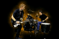
Know One Knows - Performance
Footage - The use of transitions also links into the continuity and discontinuity style. For a continuity style you will most likely have simple jump cuts where as there is more room for experimentation in a discontinuity style piece.
- Another common convention is the the use of a diagetic intro or interlude within the video. Another important part in some genre's is cutting to the beat.

Vodcast on general video conventions:
We looked at music from the electronic/dance genre for our genre specific examples. Obviously in these videos we saw a lot of the general conventions pop up again, however there where specific conventions which cropped up that where specific to our chosen genre.
- We saw the use of a dance move in a couple of examples, in Sebastian's 'Embody' we see the same dance move repeated in a variety of situations. This move is catchy and can be easily replicated by fans of the song.
- We also saw the use of inter-textual references in Deadmau5' 'Ghosts 'n' Stuff' where the main protagonist has a tattoo from the retro game space invaders.
- Another common theme within videos of the genre is the use of special effects which would make sense with the electronic genre. We see this in 'Illmerica' and 'Levels'.
- We also see an example of a viral marketing campaign in one of the videos 'I Love U so'where viewers of the video can download an app with a mouth lip syncing words to the song so they can make their own version. This will help spread the music video and give a way for the artist to interact with their audience. The conventions we see in these video help to appeal to the targeted audience of 15-24 year olds.
Vodcast on genre specific conventions:
Digipak:
For the digipak examples I looked at there where a range of conventions to take in.
 |
| Ignacio Fernandez- Buscare |
- The first and most obvious convention of the digipak's I have looked at is the title of the album and the artists name on the front pannel.
- There will normally be an image on the front of the digpak dipicting the artist or a concept image which relates to the centre.
- We normally see a specific colour scheme all the way through the design of the digipak relating to the front cover. An example of this is in the Daft Punk's album 'Human after all'.
- The front cover will often use bright or contrasting colour in order to make the digipak stand out. In 'Buscare' bright reds and yellows contrast against a black and white image of the artist.
- On some digipaks we also see a sticker which will give information about hit singles within the album or bonus features such as a dvd or live footage.
- On the spine of the digipak we once again see the artist name and the album name, however sometimes just the album name. We will also often see logos for record labels contributing to the album as well as a CD identification number.
 |
| Daft Punk - Human After All |
 |
| Track Listings and Related Images |
- On the back of the digipak there will be an image which almost always relates to the front of the digipak or the ongoing theme throughout.
- A track listing will be displayed on the back sometime with the length of the tracks and track number.
- On the bottom of the back pannel we will see information in copyright often smaller and in a different font to the rest of the album.
- We are also likley to see a bar code as well as the contributing record companies at bottom right or left hand corner. We may also see information such as the bands website or the artists social networking sites.
- On the inside pannels we are likley to see more background images relating to the theme throughout. There will often be details such as song lyrics however due to our chosen genres minimal lyrics this is normally not the case for the genre specific deconstructions.
- We are likley to see the people who played the intruments during each song and anybody who contributed to the song such as the producer. There maybe behind the scenes pictures from tours of the band and in some cases all we see on the inside of the digipak. There are also details on the CD including the recording companies, the name of the album and the CD number.
Magazine Ad:
Going onto the magazine ad we can see a variety of codes and conventions.
 |
| Artist Logo |
- The artists logo is one of the most important informational aspects of a magazine ad. It usually comes near the top third of the advert and will either take up most of the width of the page, or take up roughly half of the page and be placed at the left side.
- The album name is an important piece of information for buyers to know. This is usually shown just below the artist logo in a smaller font. I was surprised to see that some adverts, such as one from The Offspring and one from Machine Head, completely omitted this information and even on adverts that did have the album name printed, it wasn't as prominent as I would have suspected. I presume this is for a few reasons. Firstly, due to technology, just by searching for the artists name on Amazon, iTunes or other similar stores, or by visiting the artists website, the album name would be very easy to find. Secondly, the album will often be recognised by the artwork (which I will mention in the next sub-category) so mentioning the name isn't completely necessary. Finally, today artists make most of their money by tours and so it is the artist that is predominantly being promoted and not the album. The artwork of a magazine advert will very often be an expanded version of the digipak artwork, or will at least have an element in both that is the same. This makes the album/digipak easily recognisable to people who have seen the advert.
 |
| Album Names |
 |
| Website Address |
- Reviews may be shown for the album, although this isn't too common. These reviews will usually come from magazines, newspapers or other media forms in which the primary audience is similar to that of the audience for the artist being promoted.
- A web address for the band is usually located towards the bottom of an advert and will be small and discrete but still easy to read. While this used to include the full address, including 'www.' at the start, nowadays it is more likely to just seen the domain and not have 'www.' included.
- A release date is quite important information and is given on approximately half of the magazine ads that I have looked at. It will either give the date or say 'Out Now'. I presume that those that don't give the date have already been released, but I'm not completely sure of this.
- Tour information is only occasionally included on an advert for a digipak. Obviously
an artist has to have an upcoming tour for the information to be given, but even those that do rarely include it. Generally, as already mentioned, acts make most of their money through tours rather than album/single sales, which is a trend that has only come abouts in recent years due to the shift in buying habbits and the introduction and increase in illegal file sharing. Perhaps in the future including tour information will be more common to accommodate for this change in the industry.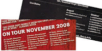
Tour Information - The record label's logo will be shown on almost all magazine ads. It will usually only take a very small space and be located at the bottom of the page, either directly in the centre or in one of the corners. Product information is most likely to be found on adverts for albums that aren't just standard CDs. There will usually be a special promotional aspect to them: '20th Anniversary Edition' or 'Includes Live Tour DVD' etc. are commonly mentioned. Occasionally though some songs from the album might be listed. This will usually be a song previously released as a single or a couple of the 'best' songs from the album.

How We Followed Convention:
Music Video:
 |
| Performance |
 In our own music video we decided to follow some of these conventions. First of all we picked a narrative style to a video with a central protagonist. Our objective with our main character was to make them stand out and look wacky and enigmatic. We included some examples of lip syncing at the start of the video during the diagetic opening which is another convention we followed.
 Our video included a variety of locations in order to keep it interesting throughout with short scenes throughout and fast paced editing. We used cutting to the beat in parts but where careful not to overuse the convention. Mostly we just used a simple jump cut in order to enforce the continuity within our piece. We also took care in order to make sure we applied the match on action principal and 180 degree rule when characters interacted.
The inclusion of a dance move within our video helped to improve it's replay value and was easily replicable. We tested this out at the creative arts evening where we got people to partake in the dance as well as making an instructional video. Another effect we used was multiple layering during some of the different encounters which we saw in the video for 'Under the Bridge'. Another effect we used was a projection during the party scene at the end of our video. This also included an element of intertextuality as the projection we used was from Daft Punk's video for 'Rollin' and Scatchin'. This was another theme we saw in our example videos so we decided to include it in our own.
Digipak:
 |
| Our Digipak |
On the spine I added the name of the album once again as well as the record label's logo on the bottom which we saw on most examples. Moving on to the back of the digipak we started by writing out the track list. We looked at of examples of the format to find out the number of tracks you would expect to see on an special edition digipak. At the bottom we added a barcode as well as the small text at the bottom which includes copyright information. We also added social networking icons to keep up with new technology so people know where they can interact with the band. On the inside we decided to include pictures from the viral contest we are running which will feature the Daft punk advert at different locations around the world. This is an important part in linking all of our media products together.
Magazine Ad:
 |
| Magazine Advert |
You can see from this prezi the way the magazine ad follows convention:
No comments:
Post a Comment